Website Accessibility: 10 Ways to Reach Everyone in Your Audience
Nearly one billion people, or more than 15% of the world’s population, have some type of disability. For this reason, staying inclusive within your business practices is a critical factor if you wish to reach as many people as possible. In this blog, we’ll teach you ten ways to use your digital tentacles to reach everyone in your audience.
One of the first elements of your brand is your web presence. Both functionality and design can either make or break a customer’s first impression of your brand. Getting it right the first time will eliminate the risk of having part of your audience base feel excluded or turned off by your organization. But, what does “getting it right” look like? To put it simply, following a few simple, yet impactful steps when configuring your website can leverage your brand big time.
Follow the POUR principles
Upon generating your unique website, the Web Content Accessibility Guidelines (WCAG) are at your disposal to help you define your goals and assure that your website reaches its maximum potential.
What exactly are the POUR principles?
Perceivable - Is the information displayed on the page portrayed to users in a way that can be easily perceived using their senses?
Operable - Does your site offer a user-friendly interface that is simple to navigate?
Understandable - Can users interpret the information you are conveying to them through your UI (user interface) design application?
Robust - Is your brand’s message presented in a way that users of all capabilities can understand and recognize it clearly?
Maximize your web space using these 10 tips.
Now that you know the basic fundamentals of proper website functionality, let’s dive into ways you can step up your game and elevate your reach.
Select the right CMS.
Before you dive into more of the heavy lifting tasks, you first need to decide on a content management system (CMS) that checks all the boxes related to website functionality, content creation, user management, and development and maintenance. All that fun stuff is necessary to maintain an easy-to-manage experience for your team. Some of the most common CMS platforms include WordPress and Kentico, among others, that make for a user-friendly experience and pave the way for your engineers to work their coding magic.
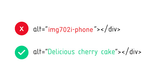
Add alt-text.
Utilizing the alt-text attribute, also known as alternative text, anywhere you can is a no-brainer. This is the text contained in an HTML element that is added to all images within your CMS. This will be the text that displays on someone’s screen if the applicable image fails to load. Therefore, making sure you generate unique and powerful alt-text will allow users who cannot view the piece of imagery to be able to interpret the feeling and emotion behind it. It is also incredibly important for when screen readers read the description aloud to their users who cannot visually interpret an image.
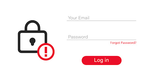
Convey your message with both words and images.
Some people are visual learners, so they need a visual representation of the message you are conveying. Others rely on written messages. You need to be able to meet the needs of your entire audience. You can do this by adding text when you intend on using a color cue. For example, if a new user’s password does not meet the requirements, you must make that clear to them by not only using colors or visuals to tell them that they are missing something, but you need to tell them with words. Remember, as much as we’d like to think they can, our audience cannot read our minds.
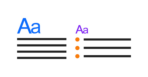
Use proper headings.
As humans, our attention generally goes to the biggest and boldest thing in the room, right? When it comes to web design, the strategy is pretty simple - the larger the text, the more important it is. Make sure you are utilizing different text sizes for headings, subheadings, and sections to emphasize to your readers the order of importance. Always arrange your headings with a logical structure so it makes sense to the reader, and be concise but descriptive so they can follow along with the information. Use the headings attribute accordingly; do not skip heading levels as that can cause confusion for the reader. They may be left wondering why the text went straight rom Heading level 1 (H1) to Heading Level 3 (H3). For more information on proper heading structure, refer to the Web Accessibility Initiative (WAI) guidelines
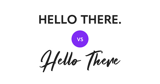
Choose easy-to-read fonts.
This step is not rocket science. When it comes to accessibility and making your website work for everyone, less is more. In this particular case, we recommend opting in for easy-to-read fonts that readers don’t have to strain their eyes in order to read.
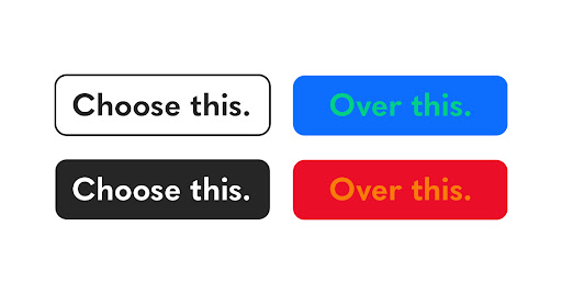
Ensure proper color contrast.
Nearly 84 percent of homepages in 2022 had low contrast text, which makes it a common error when it comes to meeting WCAG guidelines. Paying close attention to the color of both the background and the text itself is a factor that cannot be overlooked. Your information is important, so make sure your audience can clearly read your message.
Be keyboard-friendly.
Here’s a step where you might want your engineers more heavily involved. Making your website functional means ensuring users who aren’t using a traditional desktop and mouse can still navigate through your content. Users will often utilize the “tab” key to move through portions of a page. Ensuring this is an accessible feature will require a code setup and rounds of testing.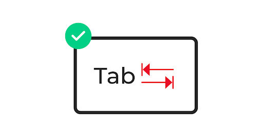
Don’t neglect mobile users.
Mobile accounts for over half of web traffic, so you have to be aware of those who are viewing your content on smartphones, tablets, or similar devices. In order to make your website mobile-friendly, we recommend reading more from the WCAG mobile guidelines.
Include captions and transcripts.
Viewers with hearing impairments or disabilities that may impede their ability to view certain photo or video content rely heavily on descriptive captions and video transcripts. This step should not be overlooked if you wish to create a fully inclusive web experience.
Test!
This is your trial and error period. Test your website to ensure it meets accessibility standards. There are numerous proven resources made available for testing purposes, one of which is a game changer for our clients specifically.
accessiBe is a top-rated partner in all things website accessibility, and they work with you to make sure your site meets WCAG and ADA compliance. Citro is proud to work alongside accessiBe and their incredible team of experts. Visit their website to learn more about their products and services and to start your free trial.
Partner with the experts.
With brands constantly competing with each other over strategy, ideas, and new innovations, if potential customers are faced with even an inch of doubt about your brand’s inclusivity, you’re likely to be faced with more challenges than opportunities.
Put our team of content strategists, designers, and developers to work! Contact us today, and we’ll get you on the road to making your website an all-encompassing user experience.
