
Citro’s Rebranding: An Exercise in Refinement
We’re pretty sure we weren’t the only ones coming out of 2020 feeling like something, anything, had to change. The pandemic left a lot of people feeling sluggish, restricted, and isolated, and it wasn’t until we reached the end of it that things began to pick up in earnest. Small beacons of hope came in many forms including three COVID-19 vaccines, soft reopenings, and government aid.
On the business side, brands were presented with more discerning and expressive customers who coincidentally seemed more trusting of businesses than the government (2021 Edelman Trust Barometer report). With so much trust placed in business, many brands were forced to confront and rethink their approach to marketing, the customer experience, and even how they presented to their audience.
It’s healthy to reevaluate your brand every couple of years as things change within a company. Starbucks is a fantastic example of how subtle rebranding can be in execution, and they’re not the only familiar brand to rethink how they presented to the public as times changed and their businesses grew.

Growth isn’t always about numbers, though. You don’t have to be some huge, successful company to rebrand; and being a smaller business doesn’t mean your brand is an issue.
Rebranding, like growth, is more about evolving over a period of time to stay relevant and authentic. Your brand is what the public sees whenever they interact with your company; and it’s meant to be a humanizing amalgam of personality, tone, and appearance. Most people change over time and that’s a valid way to treat your brand: as something that can and will evolve.
The idea of a rebrand might seem daunting, which is why we’re going to walk you through Citro’s own rebranding thought process and how we got from point A to point B.
The notion of rebranding came up in February 2021 after realizing that it had been almost 2 years since our brand and style guide had last been shown some TLC. We also wanted to simplify the way we presented our brand identity—it needed to feel modern and refreshed.
Maintaining the close partnerships we do with our clients doesn’t always leave us with much free time to deliberate and delegate our own stuff, but 2021 seemed as good a time as any to practice a little self-care.
Once the team collaborated, we focused on the Citro logo, our color palette, and fonts; and introducing subtle changes to each one to bring out the core of who we were as a company and as a team. One of our UI/UX designers ran with the concept of minimalism to flesh-out a true-to-character rebrand.
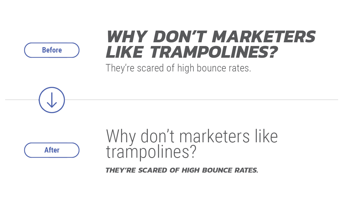
We’re big fans of open, ongoing communication when we’re working with clients. Toning down the overall angry CAPSLOCK vibe was important. That led to Roboto Condensed Light replacing Kanit as our go-to headline typeface.
Designed with simplicity in mind, the ‘orange’ and “digital” were removed from the original, leaving what you see above. Alone, the leaves symbolize growth and opportunity, and like the roots of a leafy plant, the relationships we maintain with our clients also run deep. We also thought it would be more conversational to drop the “digital,” and let our name speak for itself.
Narrowing it down to four primary colors and white, grey, and light grey for the primary palette inspired a sense of seasonal flexibility that we could see featured across our various channels throughout the year. The secondary palette was adaptable and constant without feeling restrictive, and it was certainly no longer overcomplicated by the myriad hues of 2019’s palette.
On the business side, brands were presented with more discerning and expressive customers who coincidentally seemed more trusting of businesses than the government (2021 Edelman Trust Barometer report). With so much trust placed in business, many brands were forced to confront and rethink their approach to marketing, the customer experience, and even how they presented to their audience.
It’s healthy to reevaluate your brand every couple of years as things change within a company. Starbucks is a fantastic example of how subtle rebranding can be in execution, and they’re not the only familiar brand to rethink how they presented to the public as times changed and their businesses grew.
Growth isn’t always about numbers, though. You don’t have to be some huge, successful company to rebrand; and being a smaller business doesn’t mean your brand is an issue.
Rebranding, like growth, is more about evolving over a period of time to stay relevant and authentic. Your brand is what the public sees whenever they interact with your company; and it’s meant to be a humanizing amalgam of personality, tone, and appearance. Most people change over time and that’s a valid way to treat your brand: as something that can and will evolve.
The idea of a rebrand might seem daunting, which is why we’re going to walk you through Citro’s own rebranding thought process and how we got from point A to point B.
To Rebrand, Is to Be Refined
At Citro, rebranding is a practice of refinement—not redefinition—to emphasize the familiarity of a brand. With new team members joining us at the start of 2020, we had the advantage of fresh eyes and new takes on what the core of Citro looked like and how to best express those brand qualities that most represented our roots.The notion of rebranding came up in February 2021 after realizing that it had been almost 2 years since our brand and style guide had last been shown some TLC. We also wanted to simplify the way we presented our brand identity—it needed to feel modern and refreshed.
Maintaining the close partnerships we do with our clients doesn’t always leave us with much free time to deliberate and delegate our own stuff, but 2021 seemed as good a time as any to practice a little self-care.
Once the team collaborated, we focused on the Citro logo, our color palette, and fonts; and introducing subtle changes to each one to bring out the core of who we were as a company and as a team. One of our UI/UX designers ran with the concept of minimalism to flesh-out a true-to-character rebrand.
“Working with the brand for a year before the rebrand, I could tell where things could be improved. I always took note of things that could be simplified or toned down, so going into it, I already had some thoughts of what a rebrand might look like.”
— Sarah Karess, Citro UI/UX Designer
— Sarah Karess, Citro UI/UX Designer
We Started By Flipping the Script
We utilized the Kanit typeface extensively in the past for headlines in digital and print, but it started to feel...kind of aggressive. The text was a stark black and it was always in all caps. Our subhead and body copy fonts (Roboto Condensed and Roboto, respectively) seemed closer to Citro’s tone which is wholly conversational, but there was still something a little off about them.We’re big fans of open, ongoing communication when we’re working with clients. Toning down the overall angry CAPSLOCK vibe was important. That led to Roboto Condensed Light replacing Kanit as our go-to headline typeface.
Pruning the Citro Logo
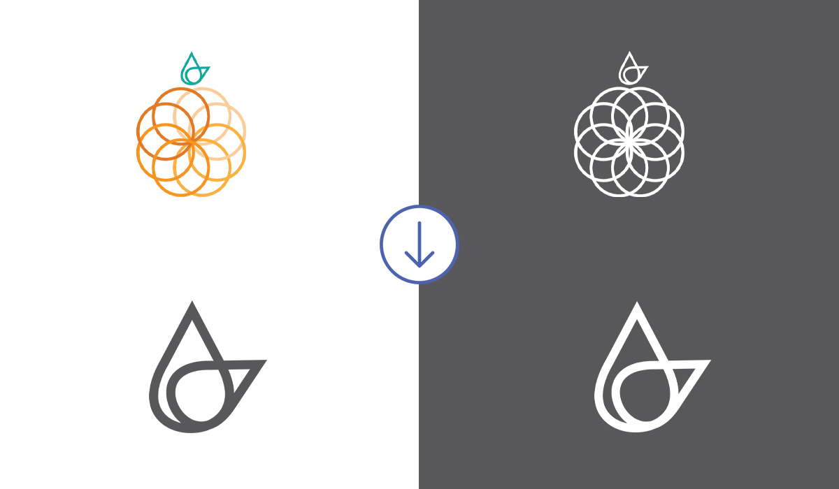
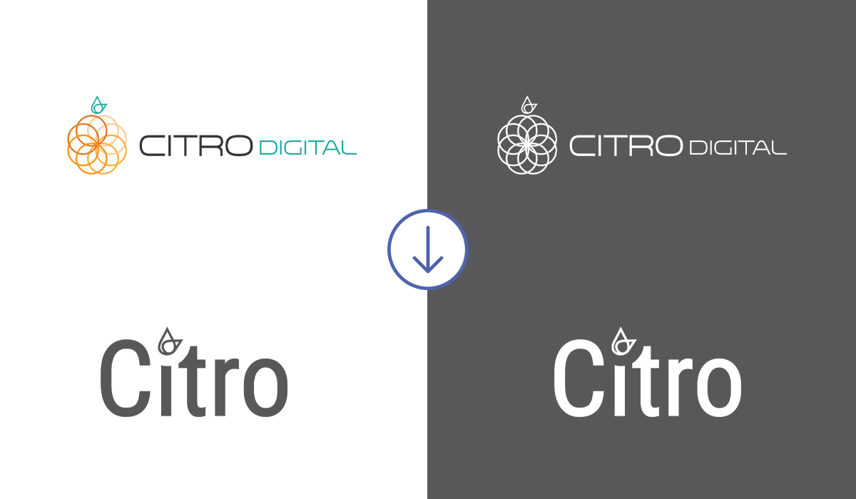
The first Citro logo (below) was a play on our name (Citro-Citrus, get it?) and the circle of life, and representative of the collaborative relationships we foster internally and with our clients. Concentric circles suggested partnership and effortless iteration. It was an expression of who we were, but the design felt too busy for the day.Designed with simplicity in mind, the ‘orange’ and “digital” were removed from the original, leaving what you see above. Alone, the leaves symbolize growth and opportunity, and like the roots of a leafy plant, the relationships we maintain with our clients also run deep. We also thought it would be more conversational to drop the “digital,” and let our name speak for itself.
In Color Theory, Less Is More
When it came to our color palettes, simplicity was an easy quality to achieve. Brand colors were stripped back to primary colors from the multiple shades, for a soft and simple palette. We ditched the shades we didn’t use as much because that’s what you do when you’ve got clothes in a drawer that no longer fit. And the rebrand was definitely about presentation.Narrowing it down to four primary colors and white, grey, and light grey for the primary palette inspired a sense of seasonal flexibility that we could see featured across our various channels throughout the year. The secondary palette was adaptable and constant without feeling restrictive, and it was certainly no longer overcomplicated by the myriad hues of 2019’s palette.
The Core of Citro
The refreshed fonts, new color palettes, and logo designs brought us closer to expressing the core of who and what our brand has always been about: courage, communication, and commitment.Courage
Fear is something that can hold us back in life, so we have to have hard conversations, with ourselves or together, and have the courage to get through those situations. It also takes courage to take an objective look at your brand and make the changes that can come out of those hard conversations.“As a business, you’re constantly working towards bettering yourself and that’s okay. You have to be comfortable with changes... Rebranding doesn’t mean changing your mission or your strategy—it’s about staying relevant and accessible.”
— Hillary Long, Owner of Citro
We like to keep it real with our clients. That includes being transparent about the processes and roadblocks that might come up. Maintaining a dialogue with our clients isn’t just of necessity to the work. It’s vital to our relationship with them and to how we foster the kind of trust and understanding that yields truly positive results.
Rebranding can be very stressful, and occasionally you might start down one direction, only to see those ideas evolve and your direction shift. As a business, you should learn to be comfortable with your own evolution, what you’re doing, and know that a rebrand can be done so it doesn’t negatively impact you or increase work demands.
They say “wine gets better with age,” but think about it. Yes, the wine will change in color, taste, etc., but those changes aren’t inherently beneficial or detrimental—so aging won’t make the wine better or worse. It’s that the wine changes at all, and continues to change while it ages, that informs the adage and appeals to wine enthusiasts.
You can apply the same perspective to your fans. You don’t earn customer loyalty by staying the same after all these years: you earn it by staying familiar. They keep coming back because you evolve along with the times and the people in it, adapting to the changing preferences, tastes, or needs of those you’re marketing to while staying true to your brand.
— Hillary Long, Owner of Citro
Communication
We like to keep it real with our clients. That includes being transparent about the processes and roadblocks that might come up. Maintaining a dialogue with our clients isn’t just of necessity to the work. It’s vital to our relationship with them and to how we foster the kind of trust and understanding that yields truly positive results. Commitment
We consistently strive to do whatever is needed to see a project through to completion. We’re all-in with our clients, and we go above and beyond when possible to stay committed to the process and reaching its end.Conclusion
Despite wrapping up on our rebranding and most of the changes being simple, it’ll take time to implement the new brand style across the board. It’s been a soft launch and areas such as print still need to be updated; but this makes it easier on the team and the customers. Rebranding isn’t something that happens overnight—even with a detailed plan—and should be done carefully, and in stages.Rebranding can be very stressful, and occasionally you might start down one direction, only to see those ideas evolve and your direction shift. As a business, you should learn to be comfortable with your own evolution, what you’re doing, and know that a rebrand can be done so it doesn’t negatively impact you or increase work demands.
They say “wine gets better with age,” but think about it. Yes, the wine will change in color, taste, etc., but those changes aren’t inherently beneficial or detrimental—so aging won’t make the wine better or worse. It’s that the wine changes at all, and continues to change while it ages, that informs the adage and appeals to wine enthusiasts.
You can apply the same perspective to your fans. You don’t earn customer loyalty by staying the same after all these years: you earn it by staying familiar. They keep coming back because you evolve along with the times and the people in it, adapting to the changing preferences, tastes, or needs of those you’re marketing to while staying true to your brand.