
The Science Behind Design
Have you ever wondered how designers create successful work? Creativity contributes to a branded materials’ success, but the execution of ideas, from start to finish, is what makes designs effective.
It can almost seem like it comes down to a science to create visually pleasing designs. But in reality, designers utilize what are known as the elements of design and principles of design to concoct their creations. In this blog, we’ll walk you through these tools that can be applied to any content to make balanced and effective work.
Fig. 1: Line, Shape, Texture and Space

Fig. 2: Size, Value and Color
The elements of design are the building blocks of a design or image. They are tools that lay the groundwork for a visually interesting image. For how a designer uses these elements to create an effective work, is represented in the principles of design.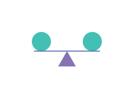
Fig. 3: Balance, Movement, Rhythm and Unity
Once a designer learns and practices the elements and principles of design, using them becomes instinctive when creating images and graphics. These tools can help communicate ideas to your audience more clearly. Designs don’t need to strictly follow these rules to be “good,” but they can truly enhance your work to be eye-catching and effective. Are you looking for a design guru to help put together new work for your brand? The design team at Citro is ready to assist you.
It can almost seem like it comes down to a science to create visually pleasing designs. But in reality, designers utilize what are known as the elements of design and principles of design to concoct their creations. In this blog, we’ll walk you through these tools that can be applied to any content to make balanced and effective work.
The Elements of Design
- Line - A line is two points connected in a space. Lines can help direct the eye in a composition. It can organize, decorate, create mood, connect, or divide elements.
- Shape - Shape is any element that is used to give or determine form.
- Texture - This element represents how an object appears or feels.
- Space - A continuous area that is free, available, or unoccupied.
- Size - Size is how small or large an object is.
- Value - This element is the lightness or darkness of a color. An example of a value is the color pink.
- Color - Hue is the specific name of a color, like red, blue and yellow. Color can communicate mood, emphasize importance, and portray lights, depth, and point of view.
Fig. 1: Line, Shape, Texture and Space
Fig. 2: Size, Value and Color
The elements of design are the building blocks of a design or image. They are tools that lay the groundwork for a visually interesting image. For how a designer uses these elements to create an effective work, is represented in the principles of design.
The Principles of Design
There are twelve principles of design. The principles build off the elements of design in how they are being used.- Balance - Everything in a design has a weight and it can come from color, size, or texture. Balance is stability created by an even distribution of weight.
- Rhythm - Rhythm is a constant repetition, or sequence of elements at regular intervals. It’s used as a way of moving your eye through the page.
- Unity - Unity refers to how well elements within the design work together.
- Emphasis - Emphasis is the focal point, or centerpiece, in your design. The first thing people see, should be the most important information.
- Movement - Movement refers to the path the viewer’s eyes take when looking at an image or graphic.
- Pattern - Repetition of elements to create a harmonious design.
- Repetition - This principle uses elements such as line, shape, and color multiple times to reinforce an idea or create unity.
- White Space - All the other principles add to a design, but this one purposely does not. White space, or negative space, is an empty area on a page that can be used to add breathing room for an object, create hierarchy and organization, and engage your audience.
- Hierarchy - Hierarchy makes the most important part of a design stand out. This principle makes you ask, “where do you want the viewer to look first?”
- Proportion - Proportion refers to the size of an object compared to others within a design. Larger objects are easier to see and are usually more important.
- Variety - This principle is used to create visual interest with line, shape, color, typography, and images.
- Contrast - Contrast is the difference between elements in a design.
Fig. 3: Balance, Movement, Rhythm and Unity
Once a designer learns and practices the elements and principles of design, using them becomes instinctive when creating images and graphics. These tools can help communicate ideas to your audience more clearly. Designs don’t need to strictly follow these rules to be “good,” but they can truly enhance your work to be eye-catching and effective. Are you looking for a design guru to help put together new work for your brand? The design team at Citro is ready to assist you.